Digital Gardens Update 4/14/22

Based off of feedback from our classmates and Prof. Maney my team members and I decided to look over the details of our project again to ensure and really set in stone what the purpose of our project is and how we can go about improving it from here. With a brief overview of what we have accomplished as a team thus far we have found the intent of our project didn’t change but that we had added to it in a way we didn’t originally account for. From the start of of our journey we were positioned on the path of creating a digital repository of information on NYC green spaces to answer the question of “What is a Community Garden in the Digital Age?”  Our infographics would of provided a one all stop for those interested and already involved in the gardens. Although we still feel this is a solid proposal, we wanted to shift the scope of our project to better reflect the current direction of what we feel our website and findings are really trying to show. Below is our first draft revision of our new objective.

Community Gardens started with seed bombs and vacant lots, today there are more than 500 gardens spread out in NYC but what is a community garden? Our project uses methods of data visualization and ethnographic interviews to explore who, how and what is accessible within these green spaces and what the effects of these gardens mean for the community that surrounds them. Our audience centers mainly around those already involved as we are approaching what they are familiar with  from a research perspective. By bringing awareness to the effects of these gardens we hope to improve the current standing of them on both a local and state level.

Additional Advantage

Through our research and ethnographic work we found that Community Gardens are largely funded by the grants provided by the federal Housing and Urban development program and  then further financed by membership payments. We hope for our work to come in use when applying for these grants- we are attempting to create solid evidence of why city green spaces are vital for the community and the environment.

Milestones, Adjustments & Going Forward 

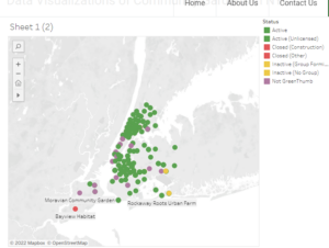
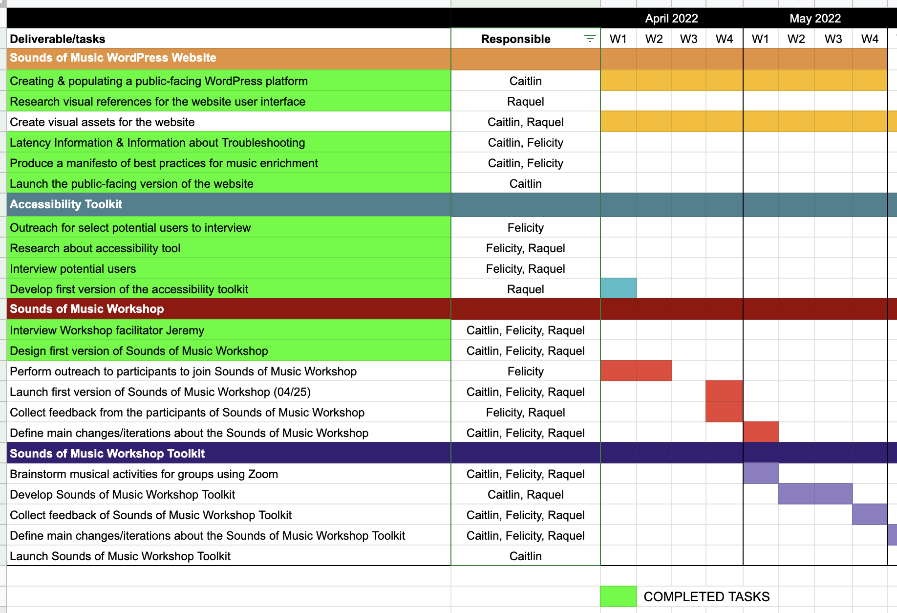
In order to meet our milestones and keep in schedule with our deadlines and revised scope of our project we have decided to condense our number of visualizations to 4.

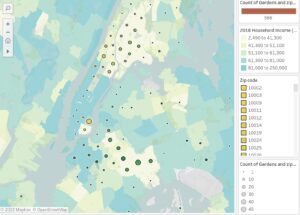
  1. Map of Income Levels- Showcase demographic of people participating/Who it is important for?
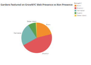
  2. Pie Chart of Web Presence- How accessible are Community Gardens?
  3.  Produce- What neighborhoods provide/give back to the community
  4. Plant Life of Gardens (will try to connect to the air quality of boroughs/neighborhoods- we have available data on both)

This Saturday we will be meeting with Kelly Hammond, the lead developer for the Who Wins with Book Awards? project. Her Tableau expertise will help us improve and advance on our journey of visualizing our findings. Please look forward to our finished work 🙂

We have also taken down the notes and comments given to us during the mock presentation and will make the following improvements in the coming weeks: fix logo to account for individuals who are visually impaired, change tone and opacity of colored points on map, change up text and image formatting for pull quotes, shorten text for final PowerPoint presentation. Lastly everyone seemed to really appreciate our use of images so we will definitely be creating a photo tab for our website (we have a lot of great pictures!)

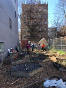
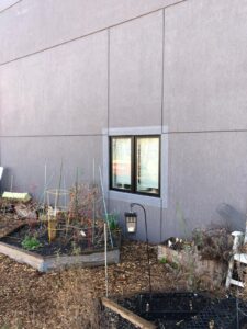
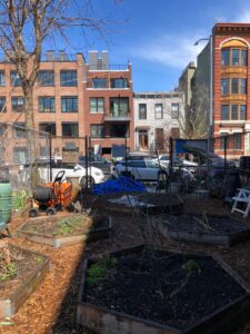
For now enjoy these pictures Benjamin has taken when doing another interview.


*Please refer to last post for Spring break details, I meant it to put it in this post.

Sounds of Music Group Project Update April 14th, 2022

 On Monday, we completed our manifesto, the text of which is pasted below:

Sounds of Music Manifesto

Introduction & Origins

 Music is human. Of this much, we are certain.

The sounds of music have been with us for millennia. Our ability to create music, to find harmony where once there had been discord, remains a defining factor of our humanity. Music is found in every culture across the globe.

Throughout human history, music has evolved and changed. For much of its history, music was ephemeral. It was played, and with the fading of the final note, it lived on only in memory. With the advent of recording technology, a rendition of a song could be repeated again and again. In the digital age, music has taken on a different, more portable life. Often, it has become a solo, individual experience.

 We seek to revive the communal aspect of listening to music. The connections and bonds formed by sharing music together endure long after the last note sounds. We seek to create a virtual space where music can be enjoyed and examined for its capacity to produce great emotional outpourings of joy, sorrow, grief, and ultimately, catharsis.

 Sounds of Music takes its name from The Sound of Music, a 1959 Broadway musical by Richard Rodgers, composer, and Oscar Hammerstein II, lyricist. The story was loosely based on a memoir about the von Trapps, a large family that acquired a substantial reputation for singing in their native Austria before they fled the country in 1938. As a family unit, they achieved immense popularity in the United States through concert tours and recordings, and eventually, they settled permanently in Vermont. The 1965 movie of the same name, starring Julie Andrews and Christopher Plummer, won five Oscars. Among the many tunes from the show that became popular standards are “Climb Ev’ry Mountain,” “You Are Sixteen Going on Seventeen,” “Edelweiss,” “Do, Re, Mi,” and “My Favorite Things.”

The sounds of music mean, to us, the human voice, every instrument capable of creating music, and synthetic musical instruments. We have focused on the former two of these three.

 Our Goals

Music is the instrument through which we are inviting members of our community to come together and form lasting, meaningful connections. Our primary target audience has consisted of elderly individuals, a population that is vulnerable to becoming isolated and lonely.

 The Sounds of Music is very much about people. People have informed every part of our user-centric design, from our website to our pilot programs to our Accessibility Toolkits. We have defined the Sounds of Music by our target users amongst the elderly population, and designed with the extreme user in mind.

We are committed to making the Sounds of Music accessible to all who might wish to partake in our music enrichment program. Music should be for everyone and anyone who wishes to listen, and we wish for our communal experience to be an uplifting, joyous one.

We believe in creating a safe, inclusive space for those who enjoy music to discuss memories that arise, connections that present themselves, and other elements of the musical experience.

We wish for our audience to come away from the pilot program smiling, feeling connected, and engaged. Since the COVID-19 pandemic, elderly individuals have not experienced the type of connections that they once enjoyed freely and without concern for their health.

We seek to remedy this by providing an online, virtual environment that is both a safe space for sharing music and memories, as well as a community-building experience during which new friendships can be formed and maintained.

Our ultimate goal is to create an online community through which the sounds of music foster new friendships and fresh perspectives. We seek to make this experience available to all who wish to partake in it. We also wish for this experience to be both customizable and easily duplicated in almost any setting, both private or public. 

~

During our Monday meeting, we also discussed the possibility of meeting again with Jeremy, a Music for Veterans facilitator who has consulted with us once before. We plan to meet with him on Friday afternoon in order to discuss our plan for the pilot program that will take place on April 25th. 

On Wednesday, we presented our progress thus far and received feedback, including but not limited to:

  • “Love the logo!” – Faihaa Khan
  • Emphasize significance in slide 2: not many DH projects have focused on elderly populations. This is one of the first. (Bret)
  • It might be worthwhile to explain why you chose zoom as the platform: ubiquity, wide adoption, etc. (Bret)
  • “I like the screenshot from the workshop. Gives a good sense of also the people connection in the project!” – Benjamin M.
  • Maybe main point: Accessibility is a major focus of our project. It has to be when serving a homebound, elderly population (Bret).

In the past few weeks, Felicity reached out to three different nursing homes and facilities, who were relatively eager to learn more, but we decided not to pursue this avenue of outreach. These facilities were Inspīr Senior Living, Terence Cardinal Cooke Harlem Nursing Home, and Amsterdam Nursing Home. 

We are looking forward to experiencing the pilot program with a more diverse group of participants, one of whom is an elderly artist friend of Caitlin’s who is well-known in the Queens artistic community. We hope that it will go smoothly, and be a positive experience for all involved. 

Kai Prenger 04/12 Personal Journal Entry

This past week, Connie and I spent most of our time learning the ins-and-outs of Wax. My primary activity was geared toward how to change the website’s style. Working with Wax brought up some key challenges related to technology choices into focus.

Sometimes when you’re working on a web development project with a small team, progress often takes longer than you think to start, but progresses faster than expected. As much as the ideal of iterative work lives on in project planning, most of our progress has some in fits and starts. Part of the slowness to is learning new domains, as required by sourcing the visual media for our archive. But another aspect, a focus of this post, has been learning technical tool from scratch.

While the Wax documentation owns up to a learning curve being “best suited for folks who are willing to take on some technical responsibility in exchange for a lot of flexibility,” the nature of statically generated site engines is that complexity is kept as minimal as possible. In fact, a Wax workflow image represents a basic explanation of how a Wax site as built. What I didn’t anticipate was the complication of additional framework/tools bundled with this particular library.

One example that we stumbled on several times during the stylistic changes was the inheritabilty of CSS/Sass used via Bootstrap. For two people with limited front end development experience, it’s hard to understand where to change fonts, colors for background, hover-overs links and text. The documentation suggests forking the Wax demo project from their repository then “clobbering” the collection using RAKE. These actions yield a complete, working set of styling and interactivity for the website with Bootstrap, but no straight forward landing spot for the new archivist without frontend design skills to update the design of their new website.

There are three Sass files in two directories that determine the CSS compiled when the site is generated.

Three Sass files in two directories

Three Sass files in two directories

All three of these files interact and depend on each other in different ways. A couple of times during this week, we struggled to understand exactly how the update a font, or a hover over color. Should we update the font-family? What about the $body-text variable created via Sass? At best, we got a compile time error when we forget to add a semicolon. We were able to make stylistic changes in the end, but if we need to make additional changes, we might not exactly remember what we did, and whether or not all of the steps we took were necessary in the end.

Some other struggles came up beyond changing styles. We still haven’t discovered why about 20% of the images we’ve uploaded don’t render on our website. Debugging this is a challenge given the size of the Wax project.

Another slate of problems we didn’t foresee are related to performance from a developer perspective. From start to finish, generating the collection takes over two hours! If you add or remove images from a collection, it’s required to rebuild the entire collection, triggering a long process working through +500 images. In a similar vein, generating the static website currently takes more than twenty seconds locally, and six and a half minutes to be deployed. I consulted a friend who formerly used Jekyll for their personal development blog, and they claimed it told four hours to build two years worth of posts. My hunch is that this is related to Digital Humanities comfortability in shipping prototypes and smaller projects, and that our collection is a little too large for Jekyll generator, being built in Ruby, a relatively slow interpretative language. These performance issues almost led to us shifting our archive over to Hugo, a static site generator build in Go , which would ameliorate any performance issues, but we decided against it due to time constraints and the introduction to yet another topic to learn about.

As mentioned before, we will likely scale down the types of media available on the archive. Given the performance issues, we wouldn’t want to experiment heavily with embedding videos, and will opt to include those on a resources page with appropriate links. I suspect we’ll be learning more about the ins-and-outs of Bootstrap, CSS, and Sass for the next week to continue to form the website appropriately given our content. We also need to focus on furnishing the appropriate context and text for the archive to give vistors a sense of themes and purpose of the website sooner rather than later. I’m still confident we will meet our shipping date in two weeks, just that it will be a rough draft we’ll need to polish in the remaining two weeks of the class.


Connie Cordon 04/12 Personal Journal Entry

This week Kai and decided to use this logo and social media icon:

It’s use for social media can be seen here:

https://www.instagram.com/themainframers/

I started uploading images onto the Instagram and updated the Tumblr page: https://th3mainfram3.tumblr.com/

In terms of milestones I am beginning to realize how time is moving much faster as the deadline approaches; I think we spent a lot of time determining what kind of content we wanted to use in order to narrow down what kind of narrative we’re trying to convey through images; and perhaps should have spent more time learning a new coding language (at least for me) and probably should have taken the time to experience how much trial and error goes into creating something from concept to finished product.

Mainframe Group Project Update 04/08

This week I presented Kai with more Logo Options and Social Media Icon options.

I started off creating a style for the page. I am still figuring out the best type for the page, but it would probably make sense to test that using a wireframe. I wanted to start off using simple color scheme based off the colors I started using for the zine– however I need to indicate which ones are specifically the primary and secondary colors. So it is still up in the air for revisions.

I also need to determine the layout, grid, and spacing rules, to define how pages are structured. I believe Wax has already determined a setting for the grid, but I’m sure it can be altered later. I also need to determine how quotes, different links, and the emphasized parts will look like.

During our zoom meeting on Wednesday Kai and I drafted up some key points to get done for next week:

  1. Meeting up next week before spring break in order to get some tech questions out of the way in person.
  2. Determine style changes we’d want to make in terms of website layouts.
  3. We’d draft writing on Notion, which is easier to copy in past into code, as Notion operates using Markdown to format texts.
  4. Determine how the slides will look for the presentation on Monday.

One thing we have come to a mixed decision on is how to fix the images that are not rendering on Wax– we could spend more time troubleshooting and hopefully learn some valuable skills in coding; or decided to edit some out of the collection in order to compress our set of images.

Bret also mentioned about extending or initial plan of using deformation in terms of these images; is an archive itself a form of deformation by placing the image in context with other similar images. To what degree do the tropes of mainframes (batch processing) figure into the archive itself?

Also on my to-do list is to check out the book Plain Text: The Poetics of Computation by Dennis Tenen, an Assistant Professor of English and Comparative Literature at Columbia University.

Modeling Value in the Anthropocene – Group Update 4.07

After a quiet week on the Anthropocene front, your two favorite Stieg-heads are back in full swing, progressing once again with our code, analysis of the text, and website design. As noted in our previous group update, our Friday appointment with Digital Fellow word-embedding extraordinaire, Leanne, proved to be wildly fruitful, resolving each of the issues that we had been grappling with during our week of entropy, allowing us a period of solace that we already look fondly back upon as we rush headlong into the wild Pythonic forests that separate us from our final goal; the modeling of value in the Anthropocene. While new coding challenges have presented themselves as we phase into the production of vectors, we’ve preemptively requested a follow-up appointment with Leanne as to continue progressing as negentropically as possible. This follow-up, coupled with our intention to take advantage of Rafa’s office hours this coming week, will inevitably keep our project in motion, allowing for any hiccups encountered until then to be swiftly smoothed over by the great noetic souls extending their knowledge to deliver us from systemic bêtise. Though this portion of the project has taken a great deal of troubleshooting, autodidactic experimentation, and consultation, we remain confident in our work plan and stand in total appreciation of the Digital Humanities community who have mentored us through this process.

Our joint-reading of Bernard Stiegler’s Nanjing Lectures is nearing its dramatic conclusion, with each page ushering us away from the dead-end banality of the Anthropocene, and towards a novel critique of political economy in the pursuit of Neganthropic potentialities. As we work to assess Stiegler’s concept of “value” in our absence of an epoch and in the fresh epoch urgently necessary through neganthropic bifurcation, we continue to grow in our theoretical foundations, allowing for our code to be replete with Stiegler’s philosophical framework and our findings to be meticulously rooted in the text.

As our efforts begin to emerge from their opaque refuge in Jupyter Notebooks as concrete findings drawn from our imminently stellar code, our outreach plan will be set in motion, allowing for scholarly contact to be at last made with more to offer than merely our intentions. As we progress towards this stage, our website will take on a fresh aesthetically-inspired shape as to support such outreach, bolstered by a series of Stiegler-centric illustrations washed in calming, muted-pastel tones. Below are some examples of our logo designs.

In a stroke of luck, Brian and I were recently approved to begin working on an additional Bernard Stiegler project for our Digital Memories course that we’ve chosen to title Modeling Memory in the Anthropocene. Conceived as an exosomatic artifact of noesis, a network graph based on a temporal and synthetic reading of the text, one that appropriates digital technology as a new way of articulating and organizing retentions and protentions (memory and anticipation), this project is exactly the kind of project that Stiegler calls for as part of contributory research based on contributory technologies of memory. It is our intention to include elements of this project within Modeling Value in the Anthropocene, as we feel it could only strengthen our analysis and provide a greater depth of insight for newcomers to Stiegler’s philosophy.

Lastly, following the advice of our professor, Dr. Bret Maney, we’ve decided that the inclusion of a blog detailing our methodologies, our tribulations, and our victories might be a beneficial addition to the final iteration of our website so that other Digital Humanities might see themselves in our process, learn from it, and improve upon it. For our classmates, a majority of this might be redundant but for future students seeking to analyze a philosophical text in a similar fashion to our modeling of value (and memory) in the Anthropocene, it could prove to be a valuable resource.

That’s all from us, folks. We wish troubleshooting code was more fun to write and read about but, hopefully, this update is sufficient and allows everyone some insight as to where we are amidst the Anthropocene.

All the best,
H & B

Digital Gardens Project Update 4/7/22

As we’re inching closer to the end of the semester my team and I have been steadily working on visualizing all the data that has been collected the first few months of our project development. As we’re producing these infographics we will also be uploading them on to our CUNY Commons website.  If you look to our site now you will see a tab labeled under Data Visualizations of Community Gardens in NYC. This tab is still a work in progress as we’re still figuring out the the functions of a page on a commons site. Every time we try to put a separate posting on our tab the vis ends up on the homepage instead of the designated tab. For now we’re putting our finished charts and maps on to one page but we will figure out how to make this more organized. Below are still images of what we have so far. (Make sure to go to our website to use the interactive features.)


The interactive map showcases community gardens in NYC and their current status. To make the points on the map clearer the viewer can click on the different colored squares on our key and highlight the specific points they want to observe. We felt the present day standing of the gardens was pertinent information to show for a number of reasons. For one it makes it easier for the average user to see what green spaces are active and available for use in their area. Please stay tuned for our critiques and explanations on this map when we provide an accompanied written section on our website.

For our pie chart we did a web scrape of the gardens featured in GrowNYC.com and investigated which gardens had an info page on their respective gardens and which didn’t. From there we compiled a list on the ones that did not and proceeded to do a deep dive exploration if these gardens had any web presence at all! With the help of a hover over feature the viewer can see how many gardens in each borough are web anonymous- a rare characteristic in this current day and age.

Milestones

According to our workplan we are pretty much on track for what we wished to accomplish by this timeframe. The data collection portion of our project has been completed so now we’re are focusing on what we have and how to present it, something we wished to do by this time! However with that being said looking towards the future and the allotted time left my team members and I have discussed the possibility of cutting down the scope of our visualizations. Originally we planned on displaying a total of 6 forms of data: Active vs Non Active, Income levels by area, gardens that supply produce, gardens supported by Obesity Task Force, plant life of gardens & Digital web presence. Although we would ideally like to have a chart or map for all of these we figured we may have to disregard 1 or 2 to stay on schedule. I also think it’s important to mention that all of us are beginners at Tableau and are learning as we go along. This means making a vis requires quite a bit of time on our part. Our team member Nelson who is the main member in charge of the vis’ has even reached out to a GC Digital Fellow for assistance. Unfortunately the fellow did not have much knowledge in the software program but did give pointers on how to organize our data sheets to make it easier to import and use, this was definitely a big help to us.

On the other side of our project, our ethnographic research has been progressing. As we had mentioned previously we have an interview with the oldest community garden member done by Benjamin, coming soon to our website. Before uploading we have condensed the audio file to an Mp3, constructed a transcript and pulled notable quotes we felt were compelling. These quotes will be sent to the interviewee who will give us the go ahead to upload. Benjamin will be visiting Quincy Community Garden on Saturday to do an observational study. By the end of this project we hope to have 3 interviews up.

Spring Break & Going Forward 

During Spring break all team members will be working independently. At this point we are all working on different aspects of the project simultaneously so our weekly meetings may take a pause to allow for more work time. With that being said we are always keeping in touch via our WhatsApp group chat to fill each other in on work that has been completed or in progress.


Sounds of Music Group Project Update April 7th, 2022

The Sounds of Music group achieved tremendous progress during this week.

Monday Meeting Minutes

On Monday, April 4th, 2022, we had a productive meeting, during which we discussed:

  • Whether or not we were meeting our milestones. We concluded that we are indeed, and that all in all, we only had to push back a few deadlines, most recently of a Sounds of Music manifesto.
  • We spoke a bit more about redesigning our pilot, and who to invite. We are finalizing our participant list. 
  • We explored the idea of bringing Jeremy on as a facilitator.
  • We are still debating what to do with our allotted 200 dollars, once it comes through.
  • We also did a brief sing-along of “Down in the Valley,” with Felicity playing the piano.
  • We discussed what music we’d been listening to as of late. Caitlin brought up “Smoke Gets in Your Eyes,” by the Platters, a song that was popular the year her mother was born, and had flown into her radar during a family genealogy project.

Wednesday Meeting Minutes

We worked on the Sounds of Music Manifesto, but were unable to complete it in one session. This is on our agenda for next Monday’s meeting. 

Tasks Accomplished & To Complete

Caitlin worked on the website, specifically the Accessibility Toolkit. 

Raquel completed the Accessibility Toolkit. Caitlin will work on transferring the remainder of it to the website in the coming week.

Raquel has been working on creating an accessible PDF that will read each slide to the viewer. She will also develop the CSV (version of the Excel document that has been storing our preliminary data and primary resources).

Felicity will be working on the format for the music program, as well as proofreading and suggesting edits to the website. Caitlin will work on implementing these edits. 

Gantt Chart Sounds of Music

Our Gantt Chart


Modeling Value in the Anthropocene – 3/31 Group Update

Modeling Value in the Anthropocene has regressed into a bit of entropy this week, as Brian’s immune system has experienced plague-induced degeneration and Hampton has come up against the structural incompleteness of his mind and his reality. Brian was unfortunately checked out for a week and a half due to a bout with COVID-19 while Hampton continued to dig further into word2vec and word embedding.

We have gotten to a point where our text is cleaned (with the cleaned version being stored locally on our machines), and we have successfully been able to play around with a word2vec model that has been pre-trained on a large corpus of text from Wikipedia. The end-goal we are working toward involves performing calculations on certain vectors from this pre-trained model with vectors from a model that we want to train on our Stiegler text. Now that we have successfully used the pre-train model, the next step for us is to train the model on our text. The problem that Hampton has been confronted with is a simple one, which is that of merely loading our cleaned text into our programming environment to begin to do so. This is where we run into problems as pirate digital humanists without a real background in computer science. However, we are very fortunate to be surrounded by a wealth of human beings with more experience than us who are willing to assist us. We have a second meeting with Leanne from the Digital Fellows Friday to figure out how to import our corpus and get back to work.

This situation (both Brian’s falling ill and Hampton’s Python woes) have also been a valuable lesson in two important Stieglerian concepts, adoption and quasi-causality (which he adopts from Gilles Deleuze and Felix Guattari). For Stiegler, following Heidegger, we are thrown into a world which has the character of being already-there, a world which pre-exists us and world over which we do not have control. We learn from Stiegler that the responsibility of the non-inhuman is to adopt this situation (of our lack of mastery over being) as necessary, and in so doing to make it quasi-causal for us. We do not have control over the initial blows that the world deals to us, but we do have the capacity to channel the libidinal energy that is generated as a result and make the situation the preindividual funds for a future-to-come. Working with Python is transforming the way we view failure, revealing its function as a departure point for progress.

Spoiler alert: I am uploading this a day late, so we have already met with Leanne, with whom we had the most productive meeting possible. She assisted us with getting our corpus into our Jupyter notebook and has brought us to the point where our model is now trained on our corpus. The next step will be figuring out what calculations we need to perform on our corpora in order to produce a new vector for value in the Neganthropocene and relate this vector to other vectors in the Stiegler text and the Wikipedia corpus. We hope to shed some light on these calculations for next week, our week thus amounting to a lot of Google-assisted programming. This will be weaved through with our continuing close reading of the lectures, which continue to stimulate us emotionally and intellectually.

Community Garden update 3/31

This week, we have made progress in line with our work plan. Benjamin had the unique opportunity to interview a current leader at a community garden. The interview consisted of a person who took care and even started a community garden before community gardens were a thing! The person describes how the city wanted to take the garden away from the residents and how they fought back against the city. As we described our digital work in progress, the  interviewee asked how can they see in real time the amount of produce available such as medicinal plants. It’s amazing how the interviewee describes their experience being at their community garden. Before I go in detail, we are currently in the process of transcribing the entire thirty minute interview to upload on our website. 


There is a social media twitter update: https://twitter.com/gardens_dh 

With wonderful photos embedded in the tweet. With our Facebook page, we updated the profile post and posted some photos as well. 


With our data collection, we created a have also created a specific file in where we can organize and pin point where some gardens have produce and those who do not. 

in this screenshot can see that there are more red than green indicating that many of these gardens in this small sample can actually offer produce to the local community. 


We are also heavily working on creating data visualization for the website. Thankfully we have enough sourced data files to start comparing and contrasting. We are focusing on learning how to use Tableau and are fortune enough to set up a meeting with a fellow in order to create some stunning stories and narratives for our website soon enough. Below is a screenshot of our current progress. While this is a draft visualization, we can safely say we are going on the correct route. 


What you see here is a density visualization of how many community gardens are located in a particular zip code; the bigger the circle, the more gardens are located. We also are comparing it to a 2018 household income data map based on how light or dark a zipcode is shown. 


Our Work plan is constantly changing. 

We added some new timelines on our ethnographic work as well as creating more data sets with a more standard bar/pie chart instead of mapping everything.