
This week, we have made progress in line with our work plan. Benjamin had the unique opportunity to interview a current leader at a community garden. The interview consisted of a person who took care and even started a community garden before community gardens were a thing! The person describes how the city wanted to take the garden away from the residents and how they fought back against the city. As we described our digital work in progress, the interviewee asked how can they see in real time the amount of produce available such as medicinal plants. It’s amazing how the interviewee describes their experience being at their community garden. Before I go in detail, we are currently in the process of transcribing the entire thirty minute interview to upload on our website.
There is a social media twitter update: https://twitter.com/gardens_dh
With wonderful photos embedded in the tweet. With our Facebook page, we updated the profile post and posted some photos as well.
With our data collection, we created a have also created a specific file in where we can organize and pin point where some gardens have produce and those who do not.
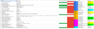
in this screenshot can see that there are more red than green indicating that many of these gardens in this small sample can actually offer produce to the local community.
We are also heavily working on creating data visualization for the website. Thankfully we have enough sourced data files to start comparing and contrasting. We are focusing on learning how to use Tableau and are fortune enough to set up a meeting with a fellow in order to create some stunning stories and narratives for our website soon enough. Below is a screenshot of our current progress. While this is a draft visualization, we can safely say we are going on the correct route.
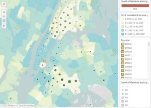
What you see here is a density visualization of how many community gardens are located in a particular zip code; the bigger the circle, the more gardens are located. We also are comparing it to a 2018 household income data map based on how light or dark a zipcode is shown.
Our Work plan is constantly changing.
We added some new timelines on our ethnographic work as well as creating more data sets with a more standard bar/pie chart instead of mapping everything.